Think of it this way: amidst a sea of choices, a wine has all but two seconds to convey something essential about its personality, its energy, the rooms in which it ought to be drunk – all by fleeting, exterior means.
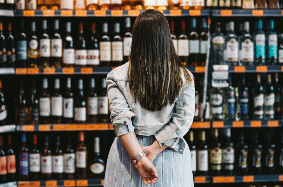
And to the untrained eye – or even the well-trained one, perhaps – all the château-de-something insignias on a shelf can start to blur together.
It’s a surface-level judgement by definition, but its roots are less insidious than that.
For producers who can’t rest on the laurels of legacy domain names or premier cru land designations (as well as for buyers without encyclopaedic knowledge of domains and regions), the label is a flawed but necessary mode of storytelling – one that hopefully contains some accurate hint as to what’s in the bottle.
‘The upside is that it invites more people in. It makes wine less intimidating and more collectable,’ says Holly Berrigan, who helms online wine club and marketplace, MYSA.
Of course, at worst, label design is a grasp at gimmicky trends – but at best, it’s an intentional depiction of flavour and terroir, delivered by a different sensory means.
According to Per Lou Amdur of Lou Wine Shop in Los Angeles, any retail venue will carry traditionally labelled ‘heavy hitter, if-you-know-you-know bottles,’ the likes of which will always sell to a certain demographic – but, on the other end of the spectrum, you’ll find ample ‘psychedelic graphics, animals, always animals, cartoon-like labels. Anything that signals, hey, this ain’t yer pappy’s Bordeaux.’
To that end, I’ll be the first to admit, we’ve certainly edged our way into twee territory – curating indistinguishable labels centred around illustrations of small critters and naked women.
In fact, this past summer, Brooklyn wine shop Vanderbilt Ave Wine Merchants distributed a zine titled: How cute animals help us pick wine, outlining the merits and shortcomings of our seeming infatuation with a certain type of label.
‘We could have picked wines with Comic Sans or Papyrus font on the labels and had the same basic discussion, but I think we all have a soft spot for furry creatures and feathered friends,’ it reads, before going on to underscore the conundrum of wines whose labels feel divorced from their contents – as well as the problematic uniformity even amongst ‘avant-garde’ labels.
‘Labels DO matter. Especially in retail,’ says Eben Lillie of Manhattan’s Chambers Street Wines. ‘People will literally say, this wine looks like it’s good, based solely on the label. It’s evoking something for them.’ That said, it works in the other direction, too: A remarkable wine with a label reminiscent of an insurance lawyer’s business card can certainly be overlooked.
Of course, drinking in a bar or a restaurant takes a different tenor – whereby you’re sampling wines and making selections based on pure taste, or by way of helpful discourse with a sommelier or a server. But even now, it’s become increasingly popular for wine bars to display bottles as something of a ‘visual wine list’ – which is to say, there’s no escaping the label lure.
The problem is that winemakers are artists and craftspeople – not graphic designers.
‘Growers are, first and foremost, farmers, spending most of their time with their plants and tractors, whereas wine retailers are merchants, spending most of their time with bottles and customers,’ says Amdur. ‘Personally, I wish I could spend more time with the plants, dirt, and tractors, but that’s not my fate.’
On the one hand, it’s absurd to expect producers to find the time to keep up with trends in mass-market visual appeal. On the other hand, no matter how principled, vignerons want their wine to sell – and presentation is an essential ingredient. Incredible winemaking does not always equate to immunity from the tenets of salesmanship.
Ultimately, the art of the thing demands some sense of intention and specificity – some commitment to honouring the wine itself.
Think: the clean, stylised text and colour scheme on Sylvain Pataille bottles, or the feathered wing on a bottle of Château de Béru Chablis. ‘Curating for an online marketplace, label curation is pretty much required,’ says Berrigan. ‘But for me, it’s not about prettiness. It’s about coherence. Does the label feel aligned with what I know or expect about the producer or region?’
Think of it like a blurb on the back of a book: Your best guess at what the thing will contain and whether or not it will suit you without cracking it open.
As I see it, there’s no obvious, pragmatic solution here. Suggesting a wine is so well-made it need not concern itself with label-culture is less pure than it is detached – but the curation of a well-wrought logo need not require female nudity or small foxes, either… nor should it supersede a devotion to the quality of the wine, itself.
Admittedly, I’m no more immune to superficiality than anyone else. Surely, I’ve missed brilliant articles for terrible headlines, or immaculate meals for gaudy restaurant facades – and in spite of a career spent writing about wine, the same goes for bottles. I imagine this is true of nearly anyone who’s ever stopped into a wine shop en route to a dinner party.
In the end, our best hope for winemakers and their teams is a little more singularity and candour. And for us, as drinkers: a bit more discernment and scepticism. A bit more readiness to be surprised.